


A single-line input field that allows users to enter short responses. It is ideal for capturing concise information such as names, short answers, etc. The field is designed for quick data entry and is suitable for straightforward, one-dimensional inputs.
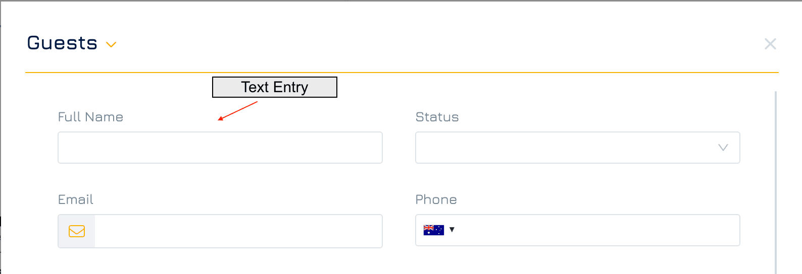
Add a Text Entry Control
Add a New Element
Click the + button in your desired location on the form to add a new element.Set Property Name and Data Type
Click New Property and enter the name of the property.
Select the data type as Text, then click NEXT.
Choose Control Type
Select Text Entry control, then click NEXT.
Configure Settings
Adjust any necessary settings for the control.Save
Click SAVE to add the Text Entry control to your form.
Settings
Besides the general form control settings, Text Entry control supports the following settings:
Data Type
Data type: Text
Sub-type: Text
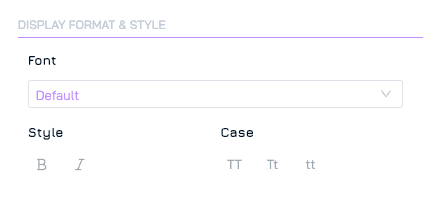
Display Format & Style
These settings allow you to customise the visual appearance of your controls. Available settings for Text Entry include font, style, and case.
Data
Min Length: Define the minimum number of characters allowed for input.
Max Length: Define the maximum number of characters allowed for input.