


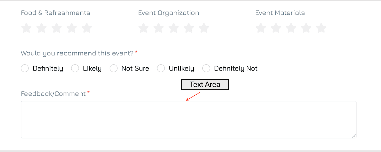
A multi-line input field that provides ample space for users to enter longer text responses. It is ideal for capturing detailed information, such as comments, feedback, or descriptions. Users can easily arrange their input across several lines, making it more user-friendly for extensive text.
Add a Text Area Control
Add a New Element
Click the + button in your desired location on the form to add a new element.Set Property Name and Data Type
Enter the name of the property.
Select the data type as Text, then click NEXT.
Choose Control Type
Select Text Area as the control type, then click NEXT.
Configure Settings
Adjust any necessary settings for the control.Save
Click SAVE to add the control to your form.
Settings
Besides the general form control settings, Text Area control supports the following settings:
Data Type
Data type: Text
Sub-type: Long Text
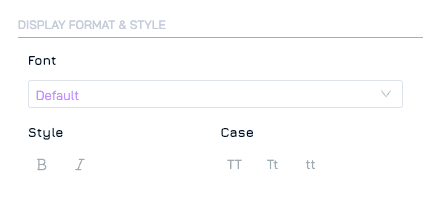
Display Format & Style
These settings allow you to customise the visual appearance of your controls. Available settings for Text Area include: font, style, and case.
Data
These settings manage how data is entered and validated within the form.
Min Length: Define the minimum number of characters allowed for input.
Max Length: Define the maximum number of characters allowed for input.
Control
Define the control’s internal settings and functionality.
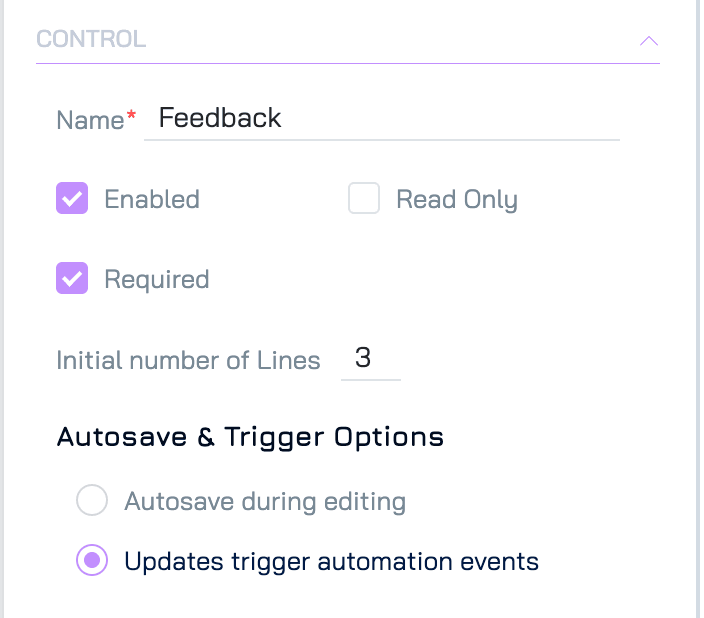
Initial Number of Lines: Define how many lines of text are visible when the form loads
Autosave & Trigger Options
These settings control how data changes are saved and how they interact with automation triggers:
Autosave During Editing: Changes are saved automatically as the user types.
Updates Trigger Automation Events: Changes are saved only after the user completes editing and either clicks elsewhere on the form or navigates away. This setting should be used when the field is intended to trigger automation workflows, ensuring changes are captured as discrete update events.