Form controls are interactive elements within a form that enable users to input, select, or manipulate data. These controls come in various types, each designed to handle specific data formats and user interactions. Below is the available list of form controls in Engyn
Control | Supported Data Type | Description | Related reading | |
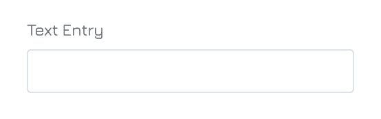
| 1 | Text Entry | Text | A single-line input field that allows users to enter short responses. It is ideal for capturing concise information such as names, short answers, etc. The field is designed for quick data entry and is suitable for straightforward, one-dimensional inputs.
| |
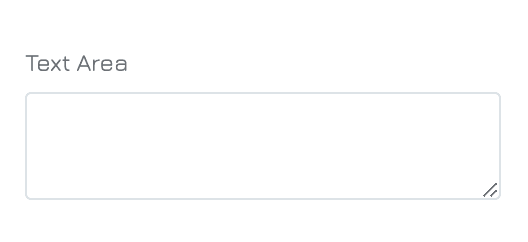
| 2 | Text Area | Text | A multi-line input field that provides ample space for users to enter longer text responses. It is ideal for capturing detailed information, such as comments, feedback, or descriptions. Users can easily arrange their input across several lines, making it more user-friendly for extensive text.
| |
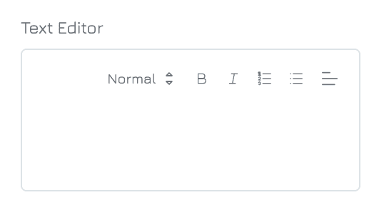
| 3 | Text Editor | Text | A versatile text editing control that allows users to input and format text with various styles (e.g., bold, italics, bullet points). It is ideal for content that requires enhanced text formatting, such as blog posts, descriptions, or articles where rich text styling is essential. | |
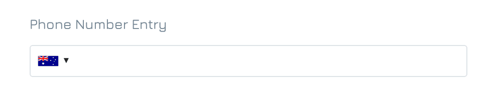
| 4 | Phone Number Entry | Text | An input field specifically formatted to capture phone numbers. This control ensures that users enter a valid phone number by guiding them through a standardized format. It includes validation to ensure only valid phone numbers are entered. |
|
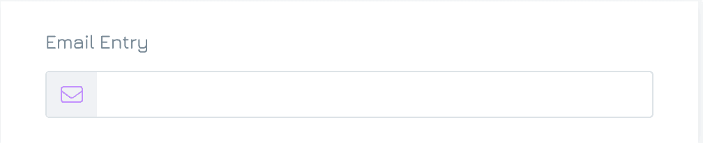
| 5 | Email Entry | Text | A single-line input field that allows users to enter their email addresses. It includes validation to ensure the input follows the correct email format. | |
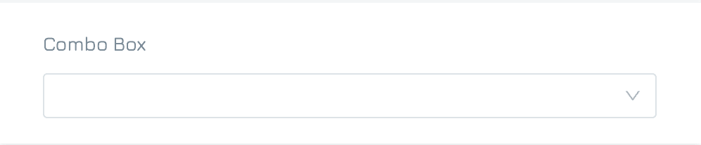
| 6 | Combo Box | Text Number | A hybrid input field that combines the functionality of a dropdown list and a text input. Users can select a predefined option from a list or add their own custom entry if the desired option is not available. This control is highly flexible and is ideal for situations where you want to offer predefined choices but also give users the freedom to input their own value. |
|
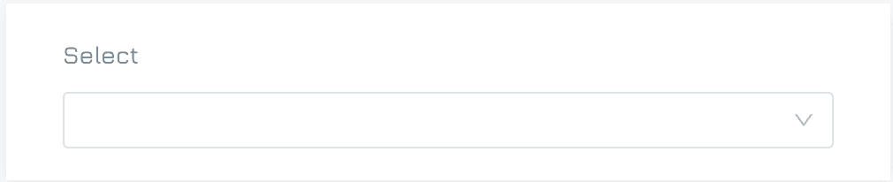
| 7 | Select | Text Number | A dropdown menu that allows users to choose one or more options from a predefined list of values. The control ensures consistency by limiting the user's input to the available choices, making it perfect for scenarios like selecting a country, department, or category where custom entries are not necessary. |
|
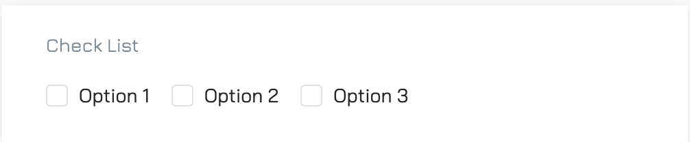
| 8 | Check List | Text Number | A collection of checkboxes that allows users to select one or more options from a list. Unlike radio buttons, checkboxes allow for multiple selections, making it perfect for use cases where users may need to pick several items, such as selecting multiple interests, services, or products. Each option can be independently selected or deselected. |
|
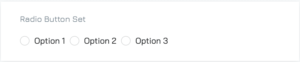
| 9 | Radio Button Set | Text Number Boolean | A group of mutually exclusive options where users can select only one choice from a list. Each option is represented by a small circular button, ensuring that users clearly understand that only one option can be chosen at a time. This control is ideal for scenarios where a single, definitive answer is required, such as choosing a preferred contact method or selecting a plan type. |
|
| 10 | CheckBox | Text Boolean | A form control that allows users to toggle between two states: checked or unchecked. It is ideal for scenarios where users need to make binary selections, such as agreeing to terms and conditions. |
|
| 11 | Switch | Text Boolean | A form control that allows users to choose between two states and is visually displayed as a sliding button. |
|
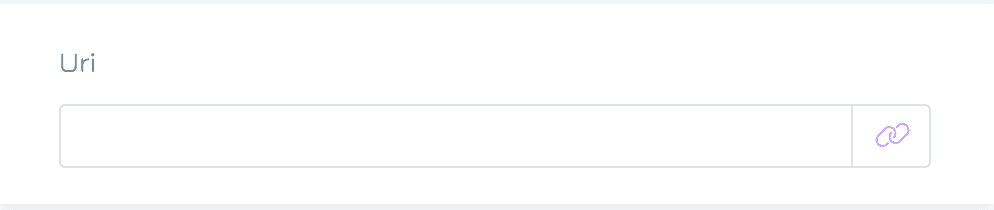
| 12 | Url | Text | A form control that allows users to input, display, or link to URLs within a form. This control is ideal for referencing external resources, documents, or web pages directly from your form. |
|
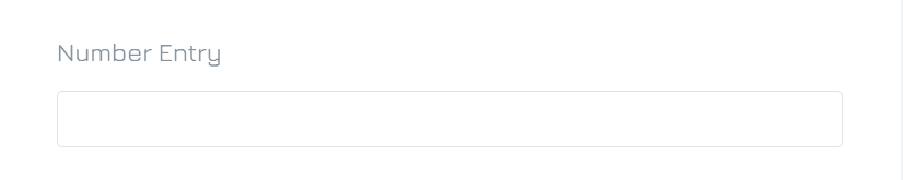
| 13 | Number Entry | Number | A single-line input field specifically designed to capture numeric values
|
|
| 14 | Slider | Number | A graphical input control allows users to select a value from a continuous range by sliding a handle along a track. |
|
| 15 | Scale Rating | Number | An input control that allows users to evaluate an item by selecting a value on a predefined scale, represented by icons. This highly customizable control can be configured to display various graphic styles, such as stars, hearts, and thumbs to suit your form’s theme or purpose.
|
|
| 16 | Date Picker | Date & Time | A user-friendly input control that allows users to select a date from a calendar interface. This control is ideal for scenarios such as booking appointments, scheduling events, or filling out forms that require a date, providing a straightforward way to capture accurate date information.  |
|
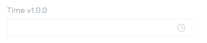
| 17 | Time Picker | Date & Time | An input control that allows users to select a specific time from a user-friendly interface with options for hours, minutes, and seconds. This control is ideal for scenarios such as scheduling appointments, setting reminders, or collecting data that requires precise timing. |
|
| 18 | Duration | Date & Time | An input control that allows users to specify extended lengths of time, including years, months, weeks, days, hours, minutes, and seconds. |
|
| 19 | Date Time Picker | Date & Time | A comprehensive input control that enables users to select both a date and a time in one cohesive interface. The date time picker typically combines a calendar view for date selection with a time spinner for hours and minutes. This control is ideal for scenarios such as scheduling meetings, making reservations, or filling out forms that require precise date and time information. |
|
| 20 | Single Record | Reference | An input control that allows users to select a single record from a predefined list of records in a table. | Single Record |
| 21 | Multiple Records | Reference | An input control that enables users to select multiple records from a predefined list of records in a table. | |
| 22 | Single User | Reference | An input control that allows users to select a single user from a predefined list of users in your organization. | Reference Property |
| 23 | Multiple Users | Reference | An input control that allows users to select multiple users from a predefined list of users in your organization. | |
| 24 | Money | Money | An input control designed to capture monetary values, formatted to display currency symbols (e.g., $, €, £). |
|
| 25 | Single File | File | An input control that allows users to upload a single file as an attachment. It supports various file types (e.g., documents, images, videos). Ideal for forms requiring single attachments like resumes or contracts, this control ensures a simple, user-friendly file upload process. |
|
| 26 | Multiple Files | File | An input control that allows users to upload several files at once. It supports various file types (e.g., documents, images, videos). This is ideal for forms requiring several attachments, such as portfolios, images, or documents, ensuring an efficient and user-friendly upload experience. |
|
| 27 | Single Media | File | An input control that allows users to upload one media file, such as an image, video, or audio file. This control is ideal for scenarios like uploading profile pictures, product images, or single media files for content submission. |
|
| 28 | Multiple Media | File | An input control that allows users to upload several media files, such as images, videos, or audio files, in one go. This is ideal for forms that require bulk media uploads, such as galleries, portfolios, or media-rich content submissions, ensuring a smooth and efficient upload experience. |
|
| 29 | Human Friendly ID | Identifier | An input control that allows users to input or generate identifiers that are easy to read and understand, often composed of a combination of letters and numbers. Unlike traditional, complex identifiers, this format is designed to be more intuitive for users, making it ideal for scenarios where memorable or user-friendly IDs are needed, such as order numbers, customer IDs, or registration codes. |
|
| 30 | Integer Identifier | Identifier | An input control that is used to capture numeric identifiers that are strictly integers (whole numbers). This control is ideal for generating or inputting sequential IDs, such as employee numbers, order IDs, or transaction numbers, ensuring a consistent and easy-to-validate format for identification purposes. |
|
| 31 | UUID | Identifier | An input control that is used to capture or generate a unique 128-bit identifier, typically represented as a string of alphanumeric characters divided by hyphens. UUIDs are commonly used in databases, systems, and APIs to uniquely identify records or objects. This control is ideal for tracking entities like users, transactions, or devices across distributed systems. |
|
| 32 | Text Identifier | Identifier | An input control that allows users to input |
|