


Form control settings are essential in determining the behaviour and appearance of controls within your forms. They allow you to tailor each control to meet specific requirements. While settings may vary depending on the control type, this guide offers a general overview of the most common settings available in Engyn.
By default, only basic settings are displayed. To access more advanced settings, expand the settings section by clicking the expand icon.
Content
This category of settings allows you to provide clear and structured information to guide users in completing the field.
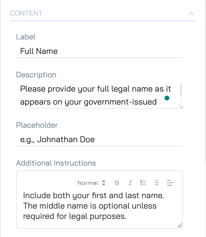
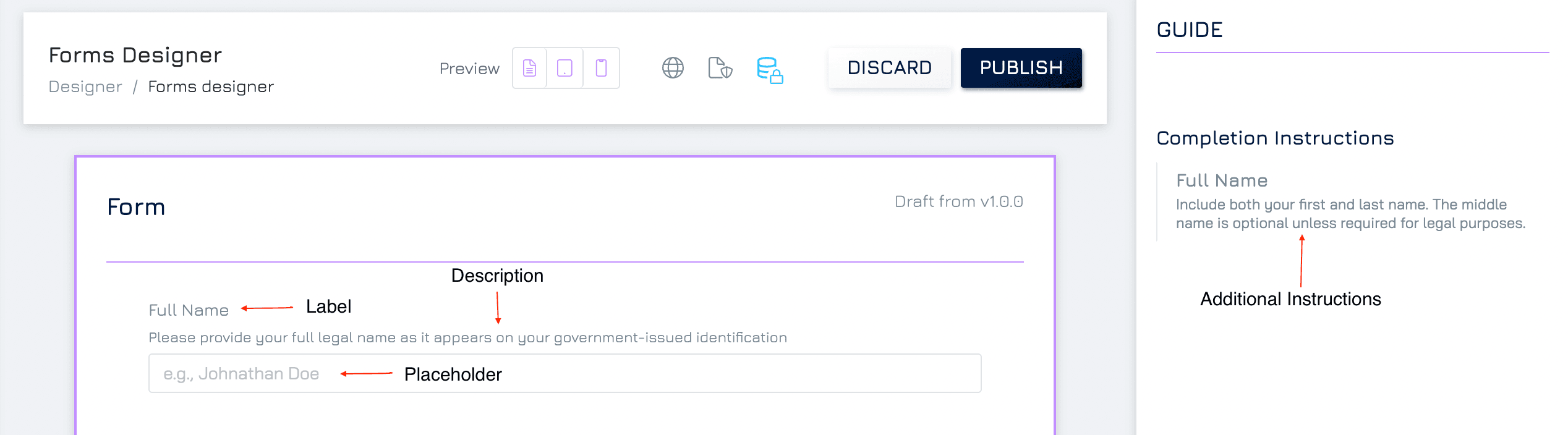
Label
The label is the text displayed above the control. It briefly explains what information users need to provide.
Description
A short explanation that appears just below the label. This helps provide additional context to ensure users enter the correct information.
Placeholder
A hint or example text that appears inside the control before users begin typing. It guides users on the expected input type but disappears once they start entering data.
Additional Instructions
Detailed guidelines presented in a separate Guide section. You can use these instructions to provide more comprehensive tips or explanations without cluttering the form design.
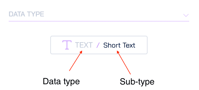
Data Type
Data type shows the data type and subtype of the underlying data connected with the control.
Display Format & Style
These settings allow you to customise the visual presentation of your controls to improve the form’s readability and user experience. This setting will be different for each control.
Data Settings
These settings manage how data is entered and validated within the form.
Note: In scenarios where the form controls the data schema (i.e. a Master Form), these settings apply not only within the form but also in all other cases (e.g., submit record via its form variant)
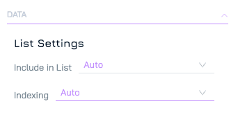
List Settings
Include in List: Control whether the data in this field appears in the table view when viewing records in Core.
Auto: The system automatically determines whether the field appears based on its type.
Summary: The field is included in the table view.
Detailed: The field is excluded from table views and only visible in form view.
Indexing: Control whether the data in this field is queryable and sortable.
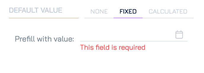
Default Value
Preset default values for fields to guide user input, improve consistency, and simplify form completion.
None
No default value is applied.
Fixed
A default value that always appears when the form is opened. This is useful for fields that regularly have the same input, such as country or default selections.
Calculated
Automatically sets a default value based on a predefined calculation or formula.
Layout Settings
These settings determine the positioning and alignment of controls within the form for a more organised and visually appealing structure.
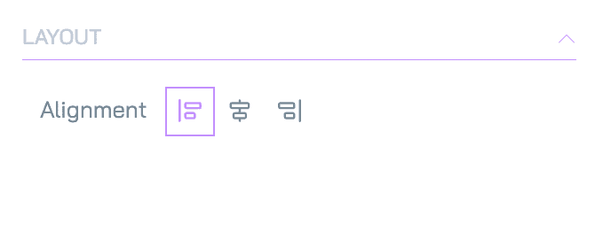
Alignment
Control how the control is aligned within the form (e.g., left, centre, or right).
Control
These settings manage the basic functionality and accessibility of each form control.
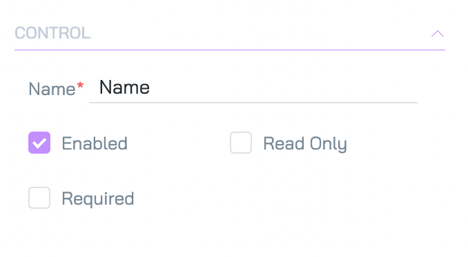
Name
Assign a unique name to the control used for internal purposes. This name is not visible to users but is crucial for managing controls within complex forms. By default, it is the same as the property’s name.
Enable
This setting determines whether the control is active or disabled. A disabled control is visible but greyed out, preventing users from interacting with it.
Read Only
When enabled, the control’s data can be viewed but not modified by the user. This is useful for displaying pre-filled data that shouldn’t be changed.
Required
This option makes the field mandatory. The form cannot be submitted until the user enters data into this control.