


Content elements are essential for structuring and presenting information in your form. They help guide users, provide context, and improve the overall user experience by organising content effectively. Engyn currently supports the following content elements:
Section Headings
Section Headings are used to divide your form into distinct sections, improving its structure and readability. They help users navigate the form more easily by visually separating different topics or sections.
Settings
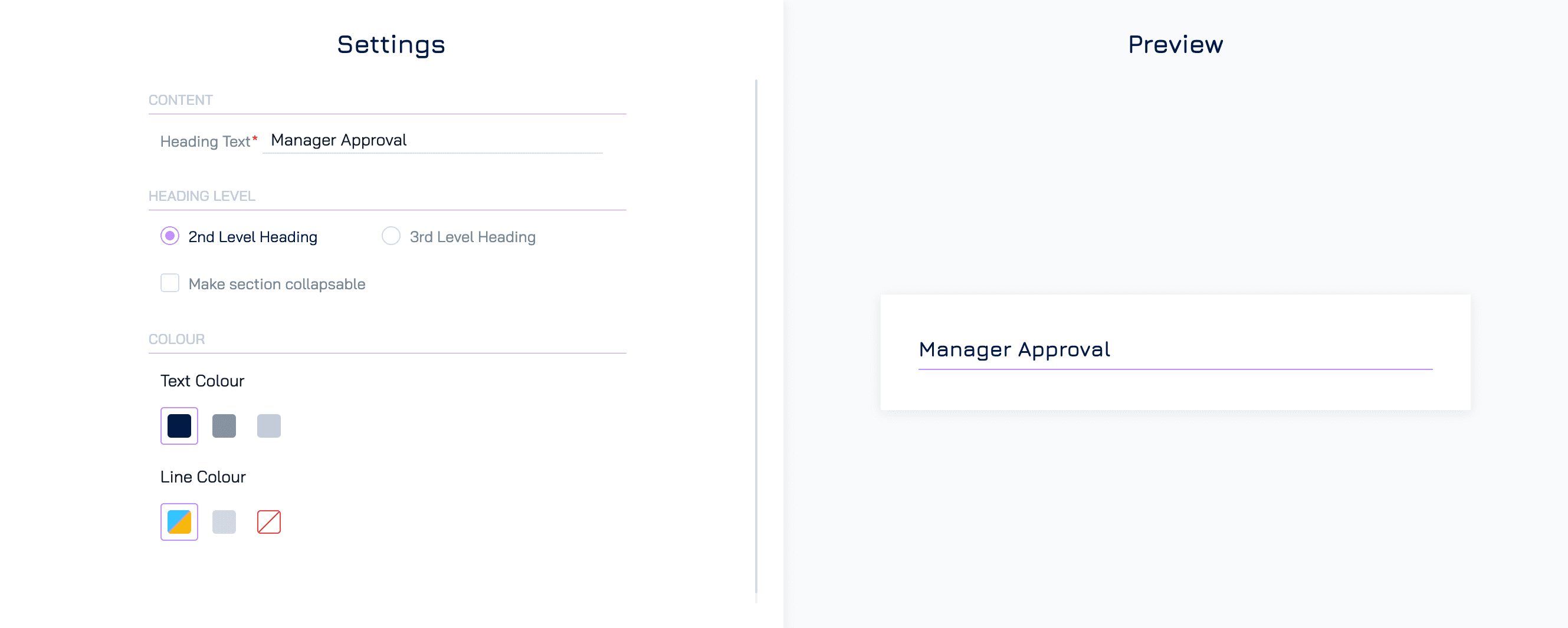
Content
Heading Text: Enter the text for the section heading. This should clearly describe the content of the section.
Heading Level: Select the level of the heading to define its size and importance:
2nd Level Heading: Larger and more prominent, typically used for main sections
3rd Level Heading: Smaller, ideal for subsections within a larger section.
Make Section Collapsible
Enable this option to allow users to expand or collapse the section. Collapsible sections are useful for forms with a lot of content, making it easier to focus on specific areas.
Colour
Text Colour: Customize the colour of the heading text.
Line Colour: Customize the colour of the horizontal line below the heading.
Content Blocks
Content Blocks are flexible sections where you can add text, headings, and images to enhance your form. Content blocks allow you to provide detailed explanations, visual aids, or additional context in a structured format, helping to create a more informative and visually rich form.
Settings
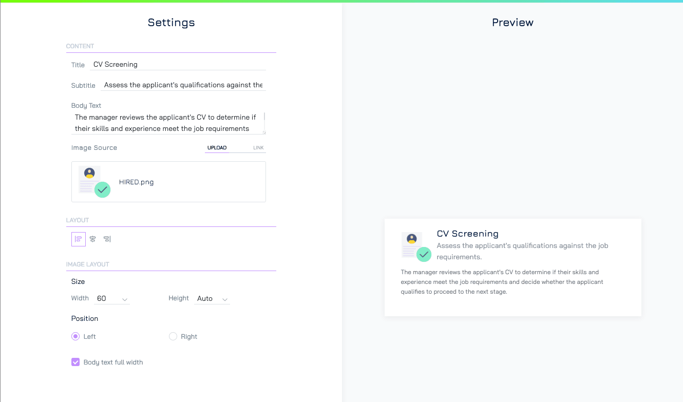
Content
Title: Add a title for the content block
Subtitle: Provide an optional subtitle to give additional context or details.
Body Text: Enter the main text content. This can include instructions, descriptions, or other relevant information.
Image Source: Add an image to the content block:
Upload: Upload an image file directly.
Link: Use a URL to include an image from an external source.
Layout
Alignment: Align the block (left, center, or right) within the form.
Image Layout
Size: Set the image width and height to control its dimensions.
Position: Set the image position on the left or right of the text.
Body Text Full Width: Enable this option to allow the body text to span the entire width of the section, regardless of the image placement.
Image
Include images to enhance the visual appeal of your form or to provide users with visual references, such as diagrams, charts, or instructional images. Images can make the form more engaging and help communicate complex information visually.
Settings
Content
Image Source: Add the image to your form using one of the following methods:
Upload: Upload an image file directly from your computer.
Link: Use a URL to include an image hosted on an external source.
Layout
Alignment: Align the image (left, center, or right) within the form.
Size: Set the image width and height to control its dimensions.
Fit: Determines how the image is displayed within its container:
Cover: Scales the image to cover the entire container while maintaining its aspect ratio. Parts of the image may be cropped to fill the space.
Contain: Ensures the entire image is visible within the container while maintaining its aspect ratio. The image may not fill the entire container, leaving blank spaces.
Fill: Stretches the image to fill the entire container, disregarding its original aspect ratio. This may distort the image.
Styled Text
Format text with various styles (bold, italics, colours) to emphasise key details or instructions. Use styled text to highlight critical information, making it more noticeable and ensuring users don’t miss important points.
Settings
Content
Add the text you want to display, such as instructions, descriptions, or important notes.